
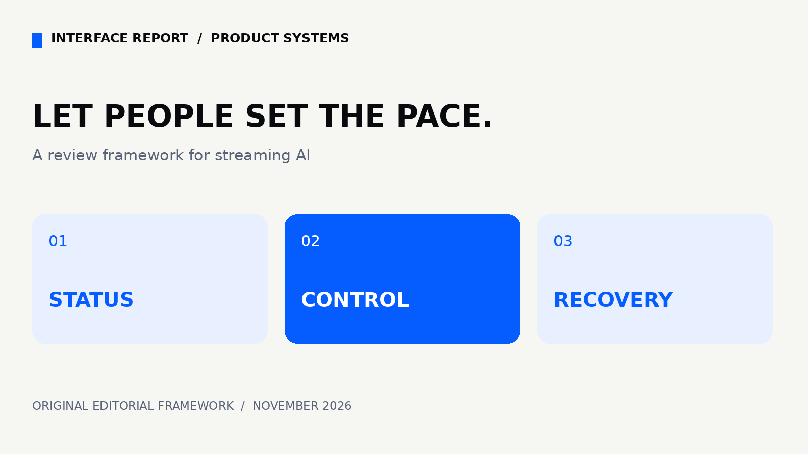
Original analysis and practical recommendations. Examples are hypothetical; no sponsor commissioned this article.
A moving answer needs a stable interface
A response appears one fragment at a time. The page scrolls, the stop button moves and a screen reader repeatedly starts speaking. The model may be producing useful work while the interface makes that work difficult to follow. This is a product design problem with an implementation boundary: answer content, process status and user controls need separate responsibilities.
This article proposes a review framework for streaming AI interfaces. It is not a report of a new model launch, an accessibility certification or a measured usability experiment. The examples describe hypothetical products. The recommendations should be tested with the assistive technologies and interaction patterns your audience actually uses.
What the standard establishes
W3C’s explanation of WCAG 2.2 criterion 4.1.3 says status messages should be programmatically identifiable so assistive technology can announce them without moving focus. It distinguishes brief process updates from the substantive content returned by a task. Our design interpretation: treat a generated answer and an announcement about that answer as different interface elements.
The distinction matters because the entire answer does not need to become an urgent notification. A compact status area can explain that generation started or finished while the answer remains available for deliberate reading. This source establishes the accessibility principle; it does not prescribe a universal streaming implementation or certify the recommendations below.
Write the state contract before the animation
Define the states a person can encounter: ready, generating, stopped, complete and failed. Give each state a plain-language label and a sensible next action. Decide whether stopping keeps the partial answer and whether retrying replaces it. These decisions belong in the product specification before a designer chooses a shimmer, gradient or animated cursor.
For a hypothetical research assistant, generating might show a stable Stop button and a short explanation that the answer is incomplete. Stopped could preserve the draft with options to continue or start again. Failed should explain what remains available. Completion should remove the uncertainty without moving the reader to another part of the page.
Announce transitions, not every fragment
Start with a separate status element and test a polite announcement when generation begins and when it ends. Keep rapidly arriving answer fragments out of that status channel. A progress label should describe something the system knows, such as receiving a response, rather than inventing invisible reasoning steps or a percentage that has no reliable denominator.
Choose announcement behavior through observation. Different browser and screen reader combinations can queue or interrupt speech differently. Test a short answer, a long answer and a failed connection. A calm visual design is not evidence that the spoken experience is calm. Capture what is actually announced, in which order, and whether the user can still read earlier content.
Keep controls where people can find them
A Stop control should remain reachable by keyboard while the response grows. Its accessible name should describe its action. When generation ends, avoid removing a focused control without a considered focus destination. The person who stopped a response should not have to navigate from the top of the document to understand what happened.
Scrolling deserves its own rule. If a reader has moved upward to inspect an earlier paragraph, new content should not repeatedly drag them downward. Offer a clear route back to the newest content. Test at high zoom and on a narrow viewport, where a growing answer can push a small control outside the visible area.
Treat partial content as a product state
An interrupted answer may contain useful text and unfinished claims. Label it as incomplete rather than presenting it with the same styling and actions as a finished result. Copying or exporting a partial answer should be a deliberate choice with the status still understandable. Never imply that stopping generation has undone an external action already performed.
Separate output recovery from action recovery. An assistant that only drafts text needs a different recovery model from one that sends email or edits a database. The interface should state which work is local, which work was saved and which action was confirmed by another service. A spinner ending cannot establish that a recipient received a message.
Review a journey, not an isolated component
Run the complete journey with keyboard input: submit, inspect progress, stop, read the partial result, retry and recover from failure. Repeat while zoomed in. Then examine the spoken journey with a screen reader. Record missing labels, lost focus, excessive announcements and content that changes while the person is trying to read it.
Keep the review findings concrete. Instead of declaring the interface accessible after one check, document the combinations tested and the unresolved cases. Turn a discovered problem into an observable acceptance condition, such as preserving focus after Stop. Product teams can then repeat that journey after changing the model, component library or streaming transport.
Make accessibility part of the release decision
The useful deliverable is a small state contract shared by design, engineering and QA. It connects a visible state, a spoken status, a keyboard action and a recovery option. That contract can stay stable even as the model changes. A stronger model does not remove the need to let a person read, interrupt and understand its output.
Review your next streaming feature by asking one question: can someone follow the work at their own pace? If the answer depends on seeing every animation or catching the newest fragment, simplify the interaction before adding more motion. Clear boundaries and steady controls are features that every reader can use.
Sources and method
Sources checked November 2, 2026. Editorial recommendations require validation in your own product. W3C: Understanding SC 4.1.3
Related analysis: Your Homepage Is Live. Is Your Contact Form?